ShowBizPizza.com Version 2.5 -
"VegaNova Presents: ShowBiz Pizza.com"
(January 2004 - December 2005)
 Intro Page |
 Homepage |
 Section Index |
"SP.com Version 2.5" is basically just a retooling of "2.0". I'm a person who despises change (let's face it, SP.com is just one big fight to try to preserve the past), so usually I only welcome change if it's something I think can improve things. So what we have here is a minor facelift and improved navigation.
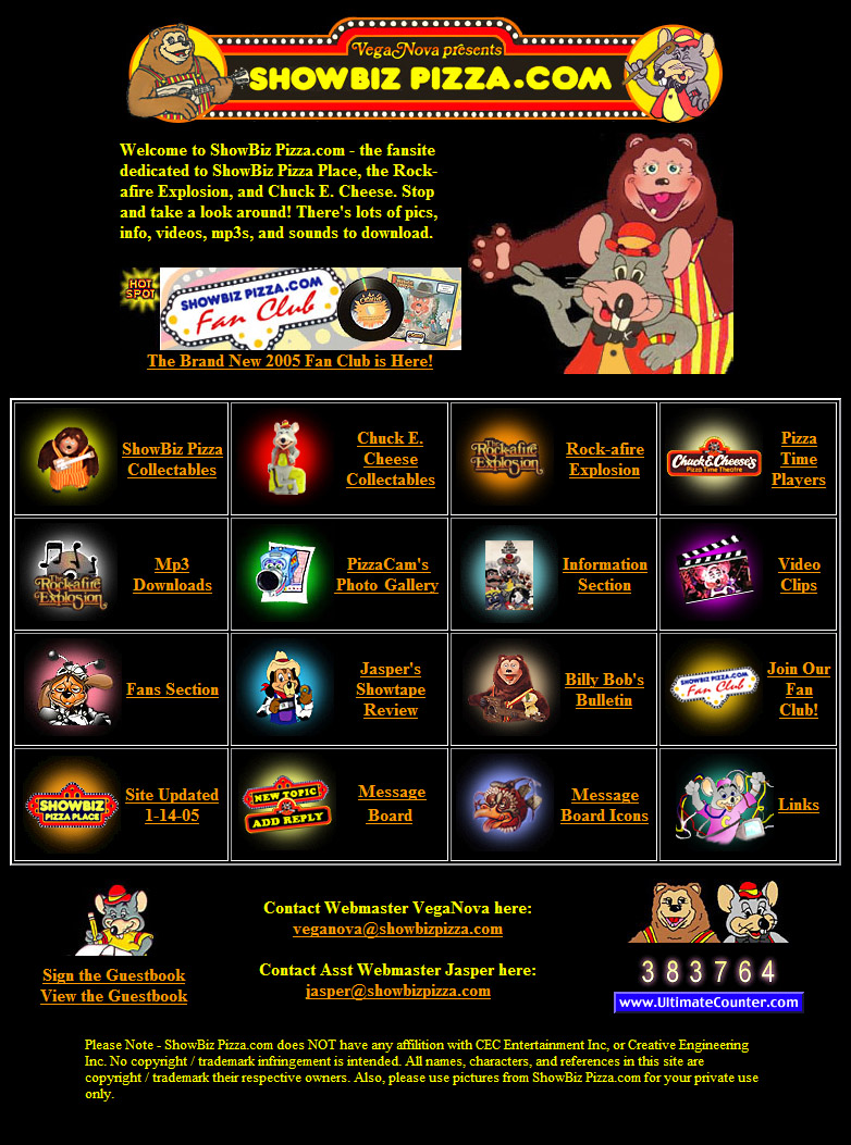
By 2004 the website was getting rather massive in terms of catalogued stuff. The rather crappy and thrown together infrastructure that I started with was becoming an obstacle as more and more things needed to find a home. Section indexes were becoming clusters and it was getting hard to tell one from another (to the point where I was having to use "sub" banners to differentiate sections). To help improve matters, I adopted a color-coded gradient system for the icons on the different section pages. The homepage was full of colors, as each icon represented a different section of the website, but once inside a particular section, all the colors matched. This definetely helped to give each section a bit of a unique identity - something that became the building block for future endavors.
It should be curious to note that this was the first instance when the website actually became known as "ShowBiz Pizza.com" - and in order to really "brand" the name, I started slapping it on everything. I guess to be accurate, I started the branding onslaught a few months earlier at the very end of 2003 with the SP.com Fan Club. And if you reeeealy want to be accurate, the first place I ever publicly used the title was on the back of a private Christmas Card I sent out to friends at the end of 2002 (more on that in the promotional wing of the tour).
At any rate, I realized that the website was more important than my own interests. It had out grown me, and even in my eyes, it was becoming increasingly unimportant who founded / updated it. So the new banner was designed to reflect that - I humbled my pride and let my "VegaNova" title become merely a footnote. Also by this point in time the old ShowBiz Pizza Page site had fallen by the wayside, so I incorporated the Billy Bob icon Nick used into the new banner. This was done as a bit of a tribute nod to his website (and also because I'm an ass and this was a quick way to "salt the earth".) Ha ha, I'm half-kidding about that last part.
Interesting tidbits: Because conquest was once a major part of building and producing this website, I leached onto a handful of domain names, simply for the selfish purpose of keeping them from other people. At one point in time "www.showbizpizza.com", "www.showbizpizzaplace.com", and "www.showbizpizza.net" all pointed to this site. Once it became apparent that we had grown to the point of fending off any newbie competition, I jettisoned the "www.showbizpizzaplace.com", selling it to someone for $125. I decided to keep the more generic "www.showbizpizza.com" because I felt it better represented both CEC and SPP which were both the focus of this site.
Many features of the web design were carried over into the next phase, including the color scheme for each section (which I admit was arbitrarily chosen). During the transformation to the next phase, much of this older design was left sitting. Visitors got to see a nice (read: ugly) temporary construction banner in place of the original.
Although it was started back in "Version 2.0", the little picture of Billy Bob and CEC on the homepage was fluid at times to incorporate seasonal themes and special events. Neat little way to add a bit of flair to the website - a seemingly innocent little treat which ultimately has pushed the transformation of "Version 3.0".